


SOME weeks back we expressed a view that all that bainisteoir gear is pointless and undignified. We overlooked the horrendous get-up the players are wearing on match day because, well, the managers have a choice and the lads on the field have to wear the uniform.
But, as time has passed, we’ve thought more and more that a few words on the modern GAA strip are in order.
In summary, these shirts are an abomination. The designers are unacquainted with the idea that less is more. Give them a jazzy sports car and they’ll paint a stripe right down the side. Show them a girl ready to hit the town dressed in her best dress adorned with a diamond necklace, diamond earnings, a load of diamond bracelets and three rings per hand, they will say, “Hmm, needs another diamond bracelet and perhaps a tiara… now we’re presentable”.
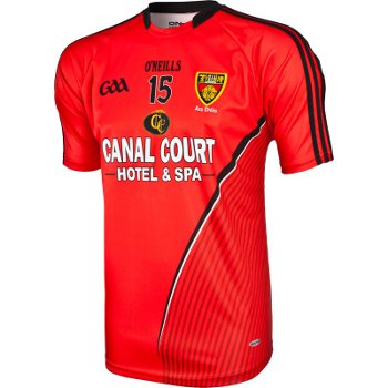
They simply cannot squeeze the breaks. Take a random example: the Down jersey starts out looking okay. Red, with three black stripes down the sleeve (somebody else thought of those stripes first, but we’ll give them a pass. Greater crimes are to come). The greater crime is the black and white slash down the midriff, below which is another bunch of lines that look like they were put there by a school kid doodling during double physics class.
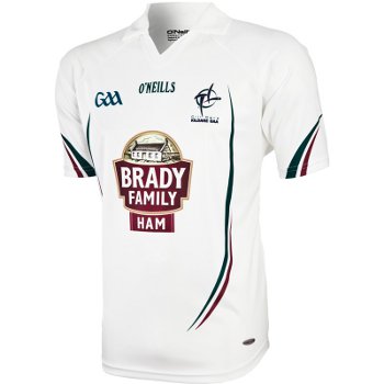
Next random example: Kildare. Now, here we have a former — and potentially present-day — classic. All white, the Real Madrid of GAA. All you have to do is leave it as white as possible. But they couldn’t help themselves. No, there’s a pair of lines, one maroon and another one which I’m not sure of, you’d need the Dulex chart for the correct term. I can only describe it as somewhere between River Lee green (pre the main drainage system) and the blue of a bruise. These lines are on the front, sleeves, and the back of the shirt. Shocking stuff altogether.
Final random example: The green and red of Mayo. The big red hoop on a green shirt has served the county through generations of near misses. It even served them through All-Ireland success, that’s how far back this design goes. But who needs a respect for tradition when you can have mainly green, a bit of red, with a border of lines and squiggles in between to prevent the stark appearance that they ran out of one colour of material and grafted on another?
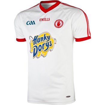
The only clear example I can see of the manufacturers getting it right is the Tyrone jersey. Nice job here. Plain white, stripes on the sleeves, smart red-lined v-neck — no flacid collar. Overall it has a solid retro feel with a contemporary fit. And then somebody puked the worst sponsor’s logo in Western Europe onto the front of it: Hunky Dorys, in brilliant phlegm-coloured yellow. Perhaps the genre is cursed.
But it wasn’t always so. Jerseys from the 1970s and before were simple, elegant, beautiful. Even the ’80s Guaranteed Irish efforts of my youth weren’t all that horrendous. They didn’t try too hard, even if they weren’t so comforatable. I still have my 1990 Cork ‘Double’ jersey and the static from the polyester would still illuminate a small town.
That was the start of the replica era jersey and things have been careering downhill ever since. The problem with replica jerseys is that the manufacturers want you to buy a new one at least every two years. People are unlikely to pay money for something that looks the same as the last one. So the simple design is out (well it can be in for a year or two and only as a break from the other garish stuff).
The upshot is some poor creature in front of an Apple Mac, using every tool on the paint bar and every colour variant in the library in an effort to make it different enough from last year to justify a new purchase.
Over time, though, you can travel too far from the template, which has happened and is the reason for the atrocities we see on the hangers today.
Offaly is the latest county where supporters have voiced reservations about the new shirt straying too far from the time-honoured style by doing away with the solid blocks of green, white and gold.
Many Dublin fans were not impressed with a red Vodafone blob polluting their blue kit. But as long as people continue to buy these shirts, companies will continue to churn them out. The greatest power any sports fan has is their purchasing power and if they withhold their cash, then the commercial interests will soon listen and act.
If sportswear designers are seeking examples of how not to f*** it up, then most Aussie Rules shirts are faithful to the original design and unadorned by mess. In America (the land many like to portray as crass and forever chasing the fast buck) they seem to be able to do without sponsors. The NBA shirts are pretty much all quite simple. Interestingly, they were among the first jerseys to crossover into fashion — maybe that’s because people don’t want to look like flashing billboards.
If a new Cork jersey appeared and it was just plain red, with no number on the front, no GAA logo (we know what sport it is) and it had the original mouth-of-the-harbour and ship logo then, provided the sponsor’s logo wasn’t too intrusive, I would buy that all day long.
Of course, I don’t expect manufacturers to produce non-manky shirts just for me. Do it for the players. They are the ones with no choice but to wear them. How are you supposed to show pride in the jersey when the jersey doesn’t look anything like it should?
